The App Interface
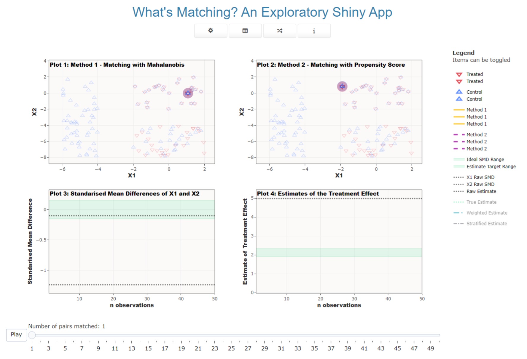
The front end of the app has been design to be minimalist but with enough information available to the user to work out what’s going on. Figure 1 below shows the main area of the app that’s visible on loading.
 |
When the app loads, the first simulation is run. This means that as soon as a user opens the app they are presented with a standard presentation of matched data to investigate. The full home screen of the app also contains a sidebar panel on the right with some additional information for users. Table 1 below outlines some of the options that users have to access through the app.
| Simulate the data and select the matching settings | |
| Look at the data and get insights | |
| Generate data from a random simulation with random matching settings | |
| Links to information about the app (this website) |
Data Simulation
Selecting the icon opens up to options for
data generation and settings for matching. There is further information
available about the options available here
vignette("DataGen", "WhatsMatching").
Data and Insights
Selecting the icon presents modal display with various information about the data that has been generated. This includes the same plots that are in the Data Generationsection. There is also a table of the data available; information about the match settings (also visible on the main page); insights about setting a calliper; and insights into the estimates of all methods with other regression model settings.
The calliper plots are similar to those laid out in
vignette("Background", "WhatsMatching"). There are four
plots that show the distances between matched pairs in an unadjusted
format (top row) and a standardised format (bottom row). The
standardised plots are measured in the number of standard deviations
above zero. The plots on the left show the distances in the order they
were matched while the plots on the right show them in order from
closest to the furthest distance. If you want to apply a calliper to the
matched data, find the observation that you think is the beginning of
the outlier group you’d like to remove. Subtract one from that number
and go to that frame using the slider on the main screen.
The plot of the estimates is similar to one shown in the Functions vignette. The user has the option of specifying which method they would like to see the estimates for. When Apply is click, the plot will generate the estimates with the 95% confidence intervals for all possible regression formulas for those methods for easy comparison.
The plotly interface
The main app feature, the frame-by-frame visualisation of matching
algorithms, has been generated using plotly. The
plotly interface has some very nice and intuitive options
for navigating visual data. Users are able to easily zoom in to plot
areas and reset them using the buttons available on the top left of the
plot. The items in the legend can be toggled out of the plot area to
make visualising things easier. The slider paused or reset, allowing
users to examine different points in the matching algorithm.
Additional contextual information is provided in a sidebar on the right. It includes some basic operational information as well as the settings for easy reference.