The functions
You can access the documentation for the functions from the navbar above. There are essentially four functions that carry the package with the fifth being the shiny app. In this vignette I will briefly go through the basic data generation and matching process to demonstrate the functionality of the package for advanced users who wish to use the WhatsMatching functionality outside of the app.
Data Generation
Let’s create some data.
#load the package
library(WhatsMatching)

#this is the most basic use of the function.
dt <- create.sim.data()

#preview the data
head(dt)
#>   t Allocation    X1     X2      y  error
#> 1 0    Control 1.000 -0.212  1.321  0.533
#> 2 0    Control 1.766  1.404  1.928 -1.241
#> 3 0    Control 1.874 -1.165 -0.780 -1.489
#> 4 0    Control 0.087  0.877  0.913 -0.052
#> 5 0    Control 0.645  0.590  0.152 -1.082
#> 6 0    Control 1.517  0.765  0.764 -1.518
Ok, we’ve loaded the package and used the most simplistic operation
of the create.sim.data() function to simulate some random
data. This will generate the plot that you may have seen in the other
vignettes for Simulation 1. You will note the inclusion of an
additional error variable in the output above. This
variable can be ignored generally, it is the value that is added to
y within the function and represents random error. You can
adjust the amount of “error” in the output by changing the value of the
jitter variable (see documentation for more
details).
Matching
Matching using generated data (or any data) is achieved using the
matched.data() function. You’ll see I’ve specified an
interaction term on X2, this is purely for illustrative
purposes.
#a formula is required to perform the matches
#the left side must contain the treatment variable
#the right side must be the covariates of interest
#you can specify any interactions you like
f <- t ~ X1 + I(X2^2)

#you must at least specify the formula, data and matching distance
m1 <- matched.data(f, dt, "Propensity Score")
Visualising the Data
The output from the matching function is extensive and provides many options for visualising how the matches have occurred. Let’s have a quick look at what we’ve got.
library(dplyr)
#>
#> Attaching package: 'dplyr'
#> The following objects are masked from 'package:stats':
#>
#>     filter, lag
#> The following objects are masked from 'package:base':
#>
#>     intersect, setdiff, setequal, union
library(ggplot2)

p1 <- m1$matched.data %>%
  ggplot(aes(X1, X2, color=Allocation, group=subclass)) +
  geom_point() + geom_line(colour="black") +
  labs(title="Figure 1. Matches from Simulation 1")

p1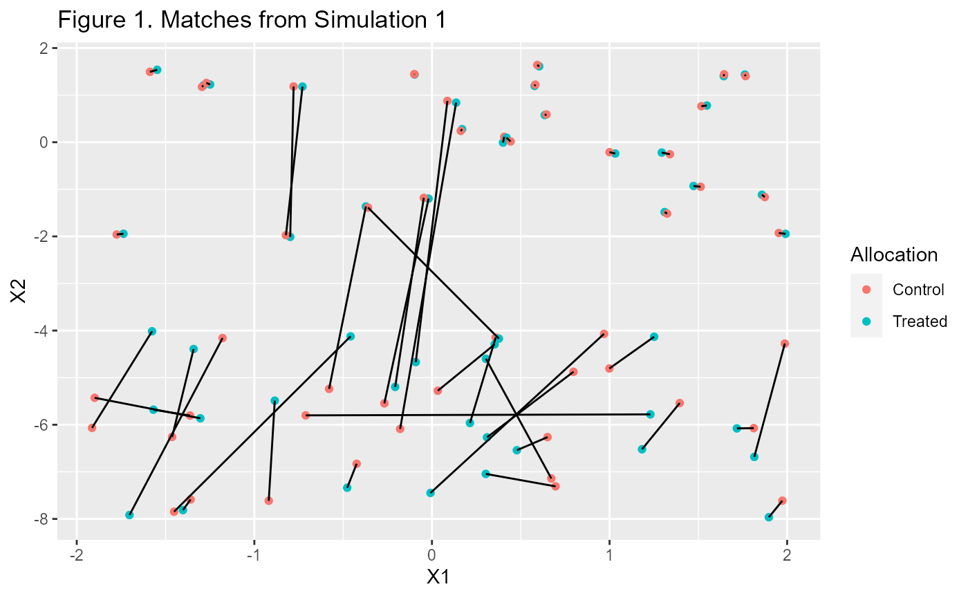
That looks interesting but aren’t we missing some data? Yes, the
$matched.data and $paired.data only contain
the rows that we matched. If you want to see all the data you need to
add it.
p1 + geom_point(data=m1$data, aes(X1, X2, color=Allocation),
                alpha=0.3, inherit.aes=F) +
  labs(title="Figure 2. All Data from Simulation 1 with Matches")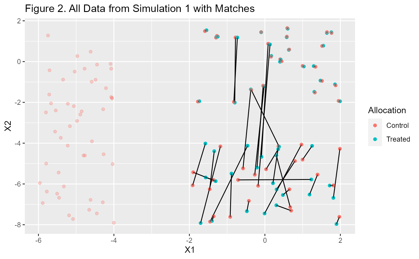
We can also do things like look at the distances each of the pairs of matched data are away from each other.
p2 <- m1$paired.data %>%
  ggplot(aes(d.order, dist)) +
  geom_point() +
  labs(title="Figure 3. Pair Distances Ordered by Distance",
       x = "Individual Pairs", y = "Distance")

p2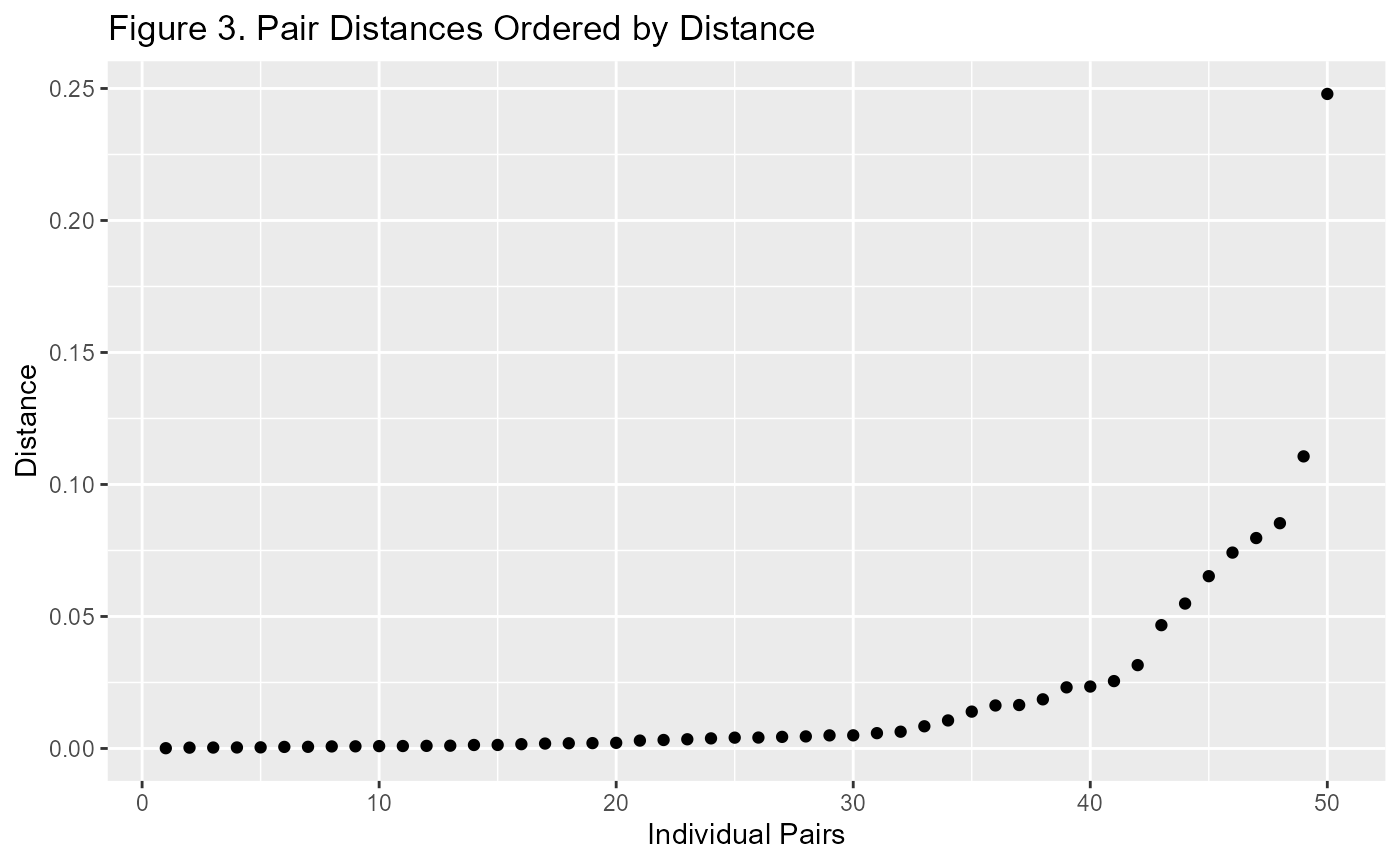
When looking at this plot, I prefer a standardised view. It is much more useful when comparing Propensity Score Matching with Mahalanobis Distance Matching. Generally I use the number of standard deviations from zero. This is because the distance is always a positive number and the closer it is to zero, the better chance of it improving covariate balance.
p3 <- m1$paired.data %>%
  ggplot(aes(d.order, dist/sd(dist))) +
  geom_point() +
  labs(title="Figure 4. Stardarised Pair Distances Ordered by Distance",
       x = "Individual Pairs", y = "Distance")

p3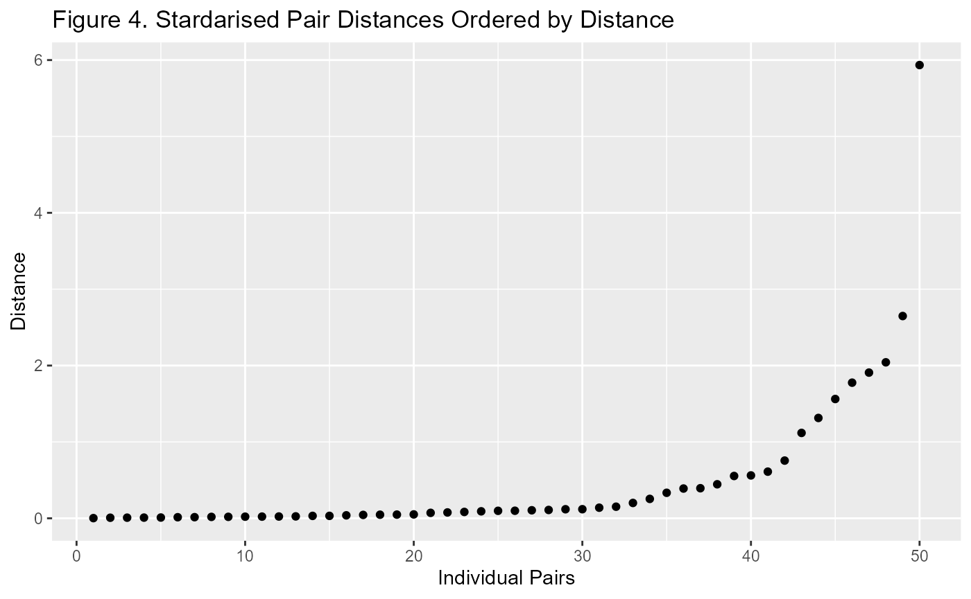
To illustrate the point I will add the Mahalanobis matched data to the plot.
#use the same formula and data as previous match
m2 <- matched.data(f, dt, "Mahalanobis")

p2a <- p2 + geom_point(data=m2$paired.data, aes(d.order, dist),
                colour="blue", inherit.aes = F) +
  labs(title = "Figure 5. Pair Distances",
       subtitle = "Mahalanobis (blue) vs Propensity Score (black)")

p3a <- p3 + geom_point(data=m2$paired.data,
                       aes(d.order, dist/sd(dist)),
                       colour="blue", inherit.aes = F)  +
  labs(title = "Standardised Pair Distances")


ggpubr::ggarrange(p2a, p3a, ncol = 1, labels="auto")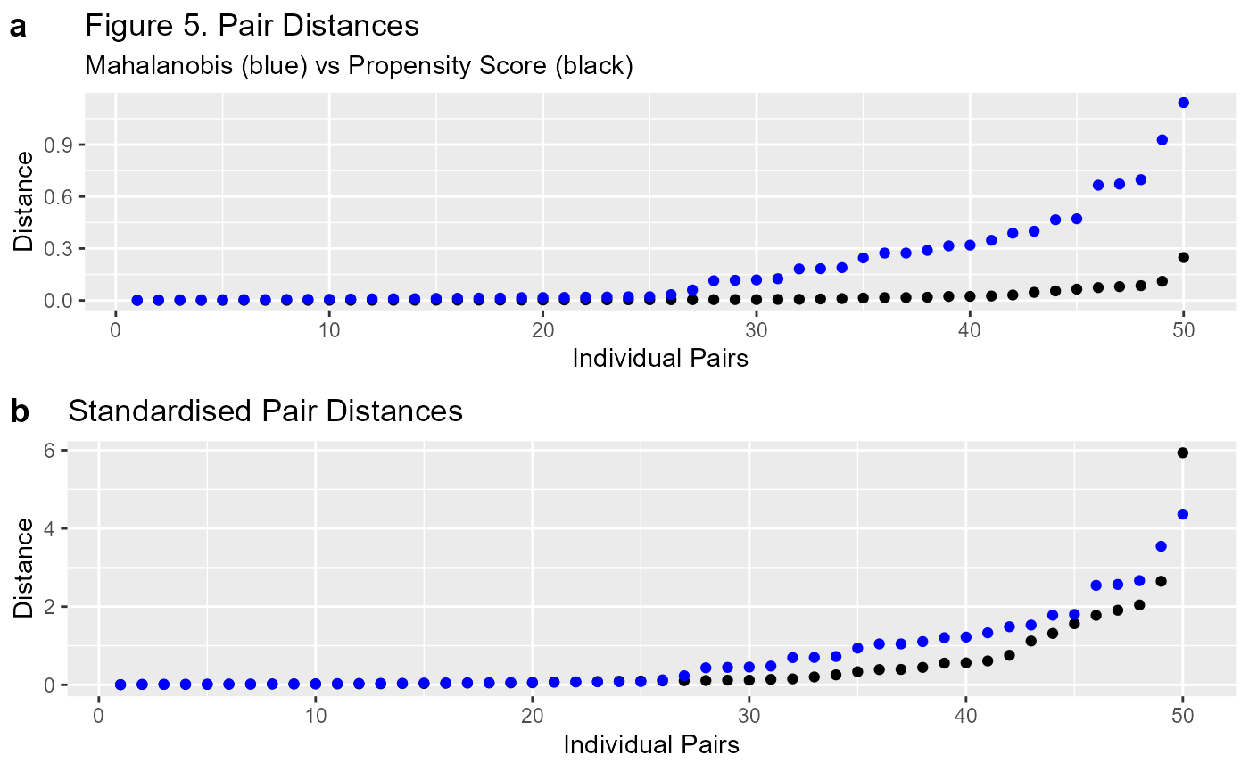
That looks much better. Figure 5 clearly demonstrates that the comparison between the two methods is much easier on the standardised plot (b). It’s important to remember that the scale is different between the Propensity Score and the Mahalanobis Distance. Standardising them means we can make an easier comparison.
Estimating Effects
There are several ways this package is set up to estimate treatment effects. We have access to a number of pre-specified variables for propensity score methods as well as the data from the matching process. Let’s do some estimating and comparisons.
#so we can compare results, let's wrap this in a function
est.plt <- function(f1, m){
    #needed for weights to work within function
    environment(f1) <- environment()

    #assign data to variable
    dt <- m$data

    #vanilla model
    mod <- lm(f1, dt)

    #weighted model
    mod.w <- lm(f1, dt, weights=m$wt.ATE)

    #stratified model
    max.strat <- max(as.numeric(m$stratification))

    stratified <- sapply(
        1:max.strat,
        function(x) {
          mod.s <- lm(f1, dt[m$stratification==x,])
          return(cbind(coef(mod.s),confint(mod.s))["t",])
        }
      ) %>% as.data.frame() %>% apply(1, mean, na.rm=T)
    #matched model
    mod.m <- lm(f1, m$matched.data)

    #put them all together for plotting
    ests <- rbind(
      cbind("Raw", coef(mod), confint(mod))["t",],
      cbind("Weighted", coef(mod.w), confint(mod.w))["t",],
      cbind("Stratified", t(stratified)),
      cbind("Matched", coef(mod.m), confint(mod.m))["t",]
      ) %>% as.data.frame() %>% mutate(across(c(2:4), as.numeric))

    #update the column names for easy reference
    colnames(ests) <- c("Model", "Estimate", "CI_L", "CI_H")


    #get the true estimate
    #we know the default values is 2 for the funtion that we used to create the data.
    #we just need to account for the error to get the accurate value
    #2 plus avg error of treated minus the avg error of untreated
    true.est <- 2 + mean(dt$error[dt$t==1])-mean(dt$error[dt$t==0])


    p <- ggplot(ests, aes(Estimate, Model)) +
      geom_point() +
      geom_errorbarh(aes(xmin=CI_L, xmax=CI_H), height=0.1) +
      geom_vline(xintercept = true.est, linetype=2)

    return(p)
}


est.plt(y~t,m1) + labs(title="Figure 6. Comparing Estimates",
subtitle="with Confidence Intervals") 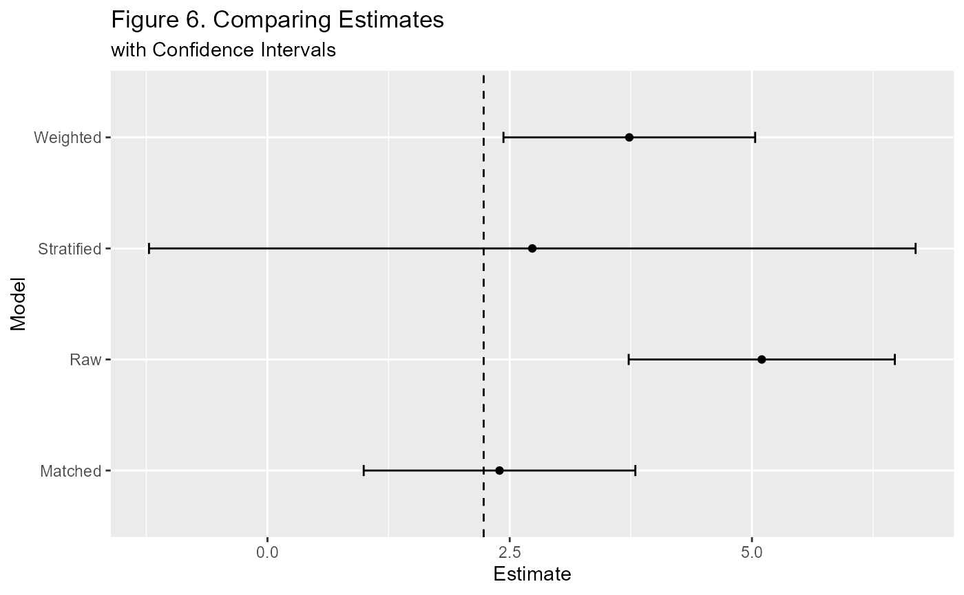
Package Plots (with Plotly)
There are 2 main plots that are included as part of this package by virtue of their use in the app. The are simple to use. The first plot is used to view the matching process. The second function includes the first in comparing to matching methods. Here’s how they work.
#you can easily update the title with the layout function
#see plotly documentation for more info - link in the navbar
WhatsMatching::matching.plot(m1, "X1","X2") %>%
  plotly::layout(title="Figure 7. Interactive Plot of Matches")
This plot is interactive if viewed on the website—try pressing play or dragging the slider!
Below is the code to generate the main plot for the app. We won’t run it here as the interface is too small to use it appreciably. I recommend running it in the R console and opening it out to it’s own window.
#get the true estimate for comparison
# default for function is null if you don't have it.
true.est <- 2 + mean(dt$error[dt$t==1])-mean(dt$error[dt$t==0])

WhatsMatching::combined.plot("X1", "X2", m1, m2, true.est, y~t) %>%
  plotly::layout(title="Figure 8. Main Plot from the App")